Thursday, 29 November 2012

Music magazine, double page spreads.
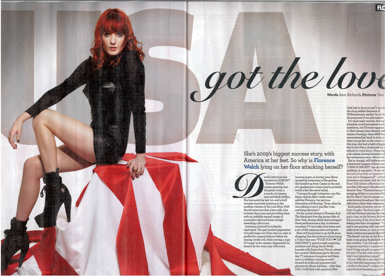
This is a double page
spread of the Florence and the machine NME addition. Half of
the page is taken up by an image of Florence herself this indicates
to the readers that the article next to it is completely about her.
It has USA in the background of the picture which could signify
something about the article. If you didn't guess from the image that
the aticle was about her, her name is clearing written in blue to give you the final
clue as to what it may be about, her name is also the same colour as
it is on the front page and the red continues. The titles of the
article is one of Florence and the machines song name's 'you've got
the love'

This is a double page
spread from a vibe magazine. The main image is a picture of beyonces
sister solande Khowles clearly stated in the light blue writing on
the left hand side. The main image is in colour which contrasts with
the background images which are also of Solande but they are in black
and white, they may have been made black and white so that they don't
detract you r attention from the main image itself. The background
images are of Solande in the same outfit just in different poses, the
poses and positioning of Solande make her seem fashionable and model
like. The pictures look like she is going to a party and is dancing
which could suggest her music is quite fun and party like. The main
headline mentions that she has a famous sister which is not hard to
guess who when they both have the last name 'Khowles' however it is
saying forget beyonce who we know most people love, which gives her
high expectations that she is good considering they're comparing her
to beyonce. As a whole the layout of the double page spread is well
set out the images and writing do not clash and some of the writing
stands out more than others. The main picture also stands out and is
makes it obvious who the article is about.

The rolling stones
magazine yet again have kept to their rock theme and in one of their
double page spreads have an article about kings of Leon. They have
also kept to their house style with the colours red and black. 3
quarters of the page is taking up by a picture of kings of Leon
themselves making sure we know who the article is about. Because it
is a question and response double spread they have put 'Q&R' at
the top in the same font as the cover they have also made sure that
the questions and answers/responses are clearly seperated by changing
the question to bold so that they stand out more. The colours on the picture are quite dull with their only being a bit of light, the
band our wearing dark colours and rock style kind of boots which
again fits the magazine genre.
Music magazine contents pages.

As you can see from
this Contents page on NME, they keep the red house style fluent
throughout their magazine making sure that everything can recognise
NME by the constant red. They have also kept the black which is
common too. In this contents page in particular they have highlighted
a main article which they think will appeal to the target audience
which is 'oasis kicked off their world tour' this leaves the audience
reading wondering why so they will want to read more. They have used
a simple two picture layout which is different to others that use
more than 2 images but I think it works.

This is the contents
page to the vibe front cover earlier on. They have kept with the same
image that was on their front page but have positioned Nicki in a
different way. The colour of the background matches the colours of
the consume Nicki is wearing and makes her look like a snow queen
still in the theme of her being a queen. Vibe have kept their
contents page fairly simple, just a page reference a brief into to
what the page is about then underneath a little description, it's not
ordered into regulars and features.

Again just like NME the
colours red and black are constant throughout the Rollingstones
magazine, The Rollingstones have set up their pictures on the left
third and have included their features on the other side, The
numbering is clearly shown and is easy to find. The genre of the
magazine is still clearly shown by the second picture (middle
picture) making sure that the readers will constantly know what type
of magazine they're reading and being loyal to their customers still
making sure it can be for other people that like different type of
music too.
Music magazine front cover analysis (three front covers)

Straight
away on this NME magazine we are drawn to the main picture which is
Florence from Florence and the machine. If we didn't know this at the
bottom of the page in Navy her name is clearing shown, linking it the main image to the cover line, we can tell this is her because of
how big it is and wear it it positioned on the page. The masthead is
also very clear, it follows rules of codes and conventions because it
is positioned in the left 3rd.
The Masthead contrasts well with the main image and the rest of the
text also goes well with the main image. The bright vibrant red makes
the cover stand out, it draws you in straight away because it's so
powerful.

This
is a vibe magazine front cover, we can tell not only by the artist
what type of magazine this is but from the positioning of her, she is
standing upright with her hands on her hips/belly which makes her
seem powerful and maybe quite intimidating. We can also tell by her
costume that she thinks highly of herself because of the silver and
the tiara on her head, the tiara makes her seem as if she thinks
she's the queen of r 'n' b/ rap. Her facial expression is quite
intimidating, it's the sort of face that says, 'don't mess with me'
or 'I’m better than you' Not only from those we can tell the genre
but from Nicki Minaj herself and various other hints of the cover,
for example 'drake'. Again just like the NME magazine we can tell who
the person is in the main image because also in Orange which goes
with her hair it says 'Nicki minaj linking both together through the
use of orange. Vibe have thought about their colour scheme a lot and
chose to keep the orange throughout.

Rolling
stones is a rock magazine mostly as we can tell from the masthead
'Rolling stones' Rolling stones is a rock band that were about in the 60's/70's and were very popular. However there is quite a big contrast
between the magazine and the main image which is an image of Taylor
swift who we would normally associate with producing pop music. So
Rolling stones have shown that their magazine is for most genres not
just rock although they have kept their rock look by dressing Taylor
in a rock style clothes. Rolling stones have placed their masthead
all the way across and don't have an identifier however we should be
able to recognise it from the red and black if not the 'R' which is
different to the rest of the writing.
Friday, 9 November 2012
Motley crue and 50 cent.
The video and title of the song suggests that motley crue are very much interested in 'girls' in a sexual way. The main setting of the video is in a trip clue which could show that the men see women as sex objects as opposed to women. From the video we can tell they're bikers because of their clothes and the fact they have bikes, this could also suggest they are rock and roll . Part of the video could show that they think they're powerful and rebellious because they put their feet up on the table and just act in general that they are better and more powerful than everyone else.
How does his song and video represent women/girls?
In 50 cents video he represents girls as sex objects throughout the whole song, this could be shown in many ways, the clothes or lack of clothes which are very tight(pvc) The women are also stranding or sitting in a seductive way which also suggest that they are there for sexual purposes only, but act as if they're willing.
Subscribe to:
Posts (Atom)