Starting off: a brief introduction about the person and asking how they are or something that has happened to them recently.
Question idea's.
* Have you always wanted to be Solo/in a band?
*What has been you worst experience on stage?
* When did you realise you were famous?
* Have you always dreamed of singing since you were little?
* Who recogonised you had a talent for singing?
* If you weren't a singer what would you have been doing instead?
* Which singer or band did you aspire/admire when you were growing up?
* Have you ever brought your own album?
* Do you enjoy being in the lime light?
*Have you ever dated another singer?
* Who is your favorite singer?
*What age did you start singing?
* When is your next single/album out?
* Where does the inspiration for your songs come from?
* What is going about being a celeb?
* Do you have a party trick?
* In 10 years time, what do you think you will be doing?
I chose these questions because i want the questions to be quite unique and not boring questions, i wanted them to be something that the readers would want to know about their favorite artists, things they didn't already know..
Wednesday, 12 December 2012
pop magazine (Fresh) 5 line paragraph.

'Fresh' is a monthly magazine you don't want to miss out on! 'Fresh is aimed at the nesh market of 14-17 year olds that love pop music, it has a constant house style and is loyal to it's readers keeping them updated with upcoming gigs and tours, celeb gossip and interesting articles including questions and answers about all your favorite artists and bands. 'Fresh' is unique, it's not like most typical pop magazines, it has class and isn't tacky, although the name may sound like a typical pop magazine whats inside isn't. We aim to please our readers by including a wide range of artists, older established artists as well as local and current ones, and it doesn't stop there we have many competitions that will interest our readers and free posters inside. Once you buy one copy of 'fresh' you won't be able to stop.
Pop magazine double page spread photo shoot ideas.


i chose these two pictures as possible double page spread photo shoots because the article is going to be a question and answer so the pictures look like they have been taken when she was answering the questions, the model looks like she is having lots of fun again and is smiling a lot.
pop magazine, contents page possible picture.


Pop magazine front cover photo shoot ideas.
For my pop magazine i want the model to look like she was having lots of fun because thats how i want my magazine to be portrayed, 'fun and fall of energy' i took pictures of my model doing pop like poses such as spinning, blowing and kiss, hand on hip etc, the pictures are mainly medium close ups with a few that showing slightly more such as maybe a bit of the models legs (below the waist).
Pop magazine name and masthead.

Pop magazine name ideas.
 |
| i made a mind map of possible ideas of what to call my pop magazine and then i decided to use 'candy' because i think it sounds like a pop magazine . |


Pop magazine front flat plan.
 |
| This is how i roughly want the front page of my pop magazine to be laid out, i am sticky to my masthead being in mainly the left third, it may go over slightly and the picture will be cenre of the page so that it's the first thing you noice because it's going to be the main article but a different picture to the article and i want the tagline to be at the top of the page in a colour that matches the house style and picture. |
pop magazine mood board.
 |
| my pop mood board. I chose pictures that i thought were associated with the word pop such as the lips and a candy bracelet etc then i got some aritsts which do pop type music however i chose to say away from typical artists and with an exception on rihanna and little mix because i want my magazine to be different to most pop magazines, i want it to have artists that aren't generally on pop magazines but are considered pop such as Lana del rey although she fits into other categories as well. I want my magazine to be classy compared to most pop magazine that are aimed at the younger generations such as 13 year olds, i want it to be for much older teens because they listen to this type of music and i don't think a tacky pop magazine would be suitable for my age range. |
Thursday, 29 November 2012

Music magazine, double page spreads.
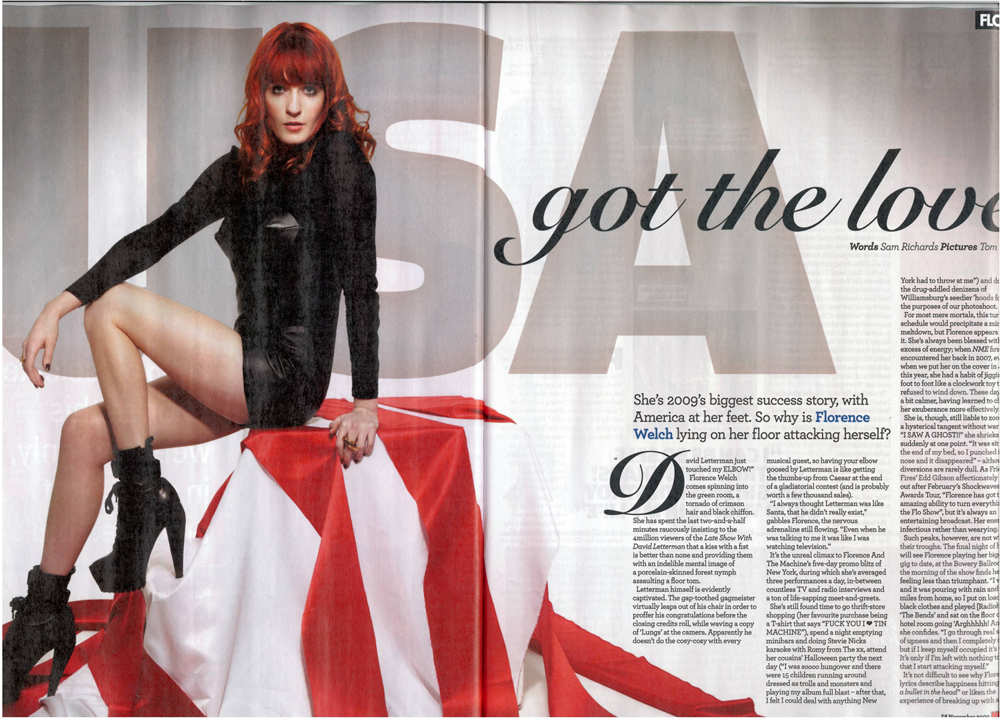
This is a double page
spread of the Florence and the machine NME addition. Half of
the page is taken up by an image of Florence herself this indicates
to the readers that the article next to it is completely about her.
It has USA in the background of the picture which could signify
something about the article. If you didn't guess from the image that
the aticle was about her, her name is clearing written in blue to give you the final
clue as to what it may be about, her name is also the same colour as
it is on the front page and the red continues. The titles of the
article is one of Florence and the machines song name's 'you've got
the love'

This is a double page
spread from a vibe magazine. The main image is a picture of beyonces
sister solande Khowles clearly stated in the light blue writing on
the left hand side. The main image is in colour which contrasts with
the background images which are also of Solande but they are in black
and white, they may have been made black and white so that they don't
detract you r attention from the main image itself. The background
images are of Solande in the same outfit just in different poses, the
poses and positioning of Solande make her seem fashionable and model
like. The pictures look like she is going to a party and is dancing
which could suggest her music is quite fun and party like. The main
headline mentions that she has a famous sister which is not hard to
guess who when they both have the last name 'Khowles' however it is
saying forget beyonce who we know most people love, which gives her
high expectations that she is good considering they're comparing her
to beyonce. As a whole the layout of the double page spread is well
set out the images and writing do not clash and some of the writing
stands out more than others. The main picture also stands out and is
makes it obvious who the article is about.

The rolling stones
magazine yet again have kept to their rock theme and in one of their
double page spreads have an article about kings of Leon. They have
also kept to their house style with the colours red and black. 3
quarters of the page is taking up by a picture of kings of Leon
themselves making sure we know who the article is about. Because it
is a question and response double spread they have put 'Q&R' at
the top in the same font as the cover they have also made sure that
the questions and answers/responses are clearly seperated by changing
the question to bold so that they stand out more. The colours on the picture are quite dull with their only being a bit of light, the
band our wearing dark colours and rock style kind of boots which
again fits the magazine genre.
Music magazine contents pages.

As you can see from
this Contents page on NME, they keep the red house style fluent
throughout their magazine making sure that everything can recognise
NME by the constant red. They have also kept the black which is
common too. In this contents page in particular they have highlighted
a main article which they think will appeal to the target audience
which is 'oasis kicked off their world tour' this leaves the audience
reading wondering why so they will want to read more. They have used
a simple two picture layout which is different to others that use
more than 2 images but I think it works.

This is the contents
page to the vibe front cover earlier on. They have kept with the same
image that was on their front page but have positioned Nicki in a
different way. The colour of the background matches the colours of
the consume Nicki is wearing and makes her look like a snow queen
still in the theme of her being a queen. Vibe have kept their
contents page fairly simple, just a page reference a brief into to
what the page is about then underneath a little description, it's not
ordered into regulars and features.

Again just like NME the
colours red and black are constant throughout the Rollingstones
magazine, The Rollingstones have set up their pictures on the left
third and have included their features on the other side, The
numbering is clearly shown and is easy to find. The genre of the
magazine is still clearly shown by the second picture (middle
picture) making sure that the readers will constantly know what type
of magazine they're reading and being loyal to their customers still
making sure it can be for other people that like different type of
music too.
Music magazine front cover analysis (three front covers)

Straight
away on this NME magazine we are drawn to the main picture which is
Florence from Florence and the machine. If we didn't know this at the
bottom of the page in Navy her name is clearing shown, linking it the main image to the cover line, we can tell this is her because of
how big it is and wear it it positioned on the page. The masthead is
also very clear, it follows rules of codes and conventions because it
is positioned in the left 3rd.
The Masthead contrasts well with the main image and the rest of the
text also goes well with the main image. The bright vibrant red makes
the cover stand out, it draws you in straight away because it's so
powerful.

This
is a vibe magazine front cover, we can tell not only by the artist
what type of magazine this is but from the positioning of her, she is
standing upright with her hands on her hips/belly which makes her
seem powerful and maybe quite intimidating. We can also tell by her
costume that she thinks highly of herself because of the silver and
the tiara on her head, the tiara makes her seem as if she thinks
she's the queen of r 'n' b/ rap. Her facial expression is quite
intimidating, it's the sort of face that says, 'don't mess with me'
or 'I’m better than you' Not only from those we can tell the genre
but from Nicki Minaj herself and various other hints of the cover,
for example 'drake'. Again just like the NME magazine we can tell who
the person is in the main image because also in Orange which goes
with her hair it says 'Nicki minaj linking both together through the
use of orange. Vibe have thought about their colour scheme a lot and
chose to keep the orange throughout.

Rolling
stones is a rock magazine mostly as we can tell from the masthead
'Rolling stones' Rolling stones is a rock band that were about in the 60's/70's and were very popular. However there is quite a big contrast
between the magazine and the main image which is an image of Taylor
swift who we would normally associate with producing pop music. So
Rolling stones have shown that their magazine is for most genres not
just rock although they have kept their rock look by dressing Taylor
in a rock style clothes. Rolling stones have placed their masthead
all the way across and don't have an identifier however we should be
able to recognise it from the red and black if not the 'R' which is
different to the rest of the writing.
Friday, 9 November 2012
Motley crue and 50 cent.
The video and title of the song suggests that motley crue are very much interested in 'girls' in a sexual way. The main setting of the video is in a trip clue which could show that the men see women as sex objects as opposed to women. From the video we can tell they're bikers because of their clothes and the fact they have bikes, this could also suggest they are rock and roll . Part of the video could show that they think they're powerful and rebellious because they put their feet up on the table and just act in general that they are better and more powerful than everyone else.
How does his song and video represent women/girls?
In 50 cents video he represents girls as sex objects throughout the whole song, this could be shown in many ways, the clothes or lack of clothes which are very tight(pvc) The women are also stranding or sitting in a seductive way which also suggest that they are there for sexual purposes only, but act as if they're willing.
Wednesday, 24 October 2012

My magazine is suitable for my target audience in many ways, one of those things being the image is of a young college student. Her fashion sense reflects the age group and the magazine. As well as the fact that the image on the front cover of the magazine includes a camera it could indicate that the magazine is about photography or some sort of media. Following on from this the masthead 'exhibition' refers to the purpose of the magazine because the title and camera link to fashion photography.
I have placed the masthead in the left third because in a shop the magazines are displayed side by side therefore the title has to be in a relevant position for the readers to see. Consequently the magazine will have to be shelved in a certain way for the title to be shown. Also to make it easier to spot this magazine I have placed a indicator on the first letter of the masthead, (E). The indicator is a basic camera which also refers to the purpose of the magazine
I think that the plain background works well because it brings all the attention to the title and the model with her camera this allows the reader to focus on the main points being the text and image. However i don't think that the cover lines (cover stories) work well because they're too light so they're harder to read when they're on similar colours.
I have learnt how to design a magazine front cover and things that work well and things that don't work well through my research into magazines.
If i had all the time and money in the world i would have picked the clothes the model is wearing so that it fits my tg even more. I would have also took a lot longer on coming up with good/interesting cover lines to attract the readers.
Lastly i would say that my magazine has a similar appearance to magazines such as vouge and elle etc because they're also fairly simple and are designed for a similar target market.


Cd analysis.
CD
analysis.
I
think my CD is quite suited to it's genre(Indie) because of the front
cover, the front cover is in the style of Indie, I chose things that
I think indie/hipster people would like, i.e I chose a record because
Indies stereo-typically like the old things(vintage) also like the Polaroid picture effect, I also chose to use an electric guitar on my
front cover because I wanted to show roughly what the music would be
like and again what is associated with other indie bands and things
Indies may listen to. The name of the band and the album name I also
think fits, the name tells the listeners the genre straight away
'indie revolution' which I think works well because it narrows an
indie's choice down.. and vintage (the album name) because again stereo-typically indies like old vintage things.
However
I don't think that the name of my band is very good although it is
straight to the point I think it could have been better although I
did find it hard to come up with a name so I picked it on a band name
generator. I'm also not too sure on the colour, because the Polaroid is white I think maybe the background colour could have been a bit
darker so it stood out more, I could have also used more bright
colours to get my CD cover to really stand out especially if it was going to be sold in shops it would need to have something that would make people attracted to it but then again it may not have fitted in with the genre of my CD.
I
have learnt a fair few things in this project of making the CD, first
I found out how to do colour splash which I used on this CD, it's not
too obvious but I had changed everything to black and white and just
had the shoes in colour I think this made it stand out a little bit
more and gave it a bit more of an original effect to it, i have also learnt how to edit things effectively.
If
I had all the time and money in the world I would have took a lot
more time so that it was even more suited to the target market, I would have maybe selected
a better band name and took different images that suited the target market more than the ones now and the genre of my band. Also I would have done the pictures in
a studio so that I could get a white background, I may have
even took pictures of people in an indie type clothes.
I
don't think I could really compare my CD cover to many others, mine
is quite different, most indie bands will have a photograph of themselves on the front
cover although I have chose to use objects instead that symbolise my genre. My back cover was very much inspired by Rizzle kicks, I
thought their back layout went well with my front cover because it
was very simple yet looked quite busy. I also liked the simplicity of their back cover, i don't think it reflects their type of music because they're up beat but it works well as a contrast between their music and cover. 
Tuesday, 23 October 2012


Saturday, 20 October 2012

Wednesday, 12 September 2012
Rita Ora's Album cover analysis.

Lana Del Rey Album cover analysis.

Tuesday, 11 September 2012
Mika album Cover analysis.

This Album cover defines the type of music quite well because of all the bright colours, it could suggest that the artist is very fun and lively and quite unique and happy. It also looks quite feminine although if you know the artist you know he is male which could be represented by the font. The font is much thicker than the usual female pop artist so this could suggest that it's not a female. The Name of the artist stands out well because the font is very big and is white so it contrasts with the bright colours in the background. I think this cd would stand out well in shops because of the bright colours however the bright colours could come across as childish and for the younger generation such as children, but you could argue that target group is for the younger generation. Also from the cover we could assume that the music on the album is targeted to younger female girls because it's looks very girls and he has chose to use a lot of pink which is sterotypically associated with girly girls or even girls in general.
Guns and roses album cover analysis.
This album cover represents the band because the genre of the band is rock and we could assume this by the cross on the front of the CD cover, also because the colour of the background is dark this could also show that the bands music is rock. The cover has the members of the band on the front but in a different, unique way to most other bands which is skulls this could also define why the band produces rock music. The name of the band is clearly written at the top of the album but isn't very big, i don't think it would stand out as much as maybe some other album covers.

Subscribe to:
Posts (Atom)